Air Canada is in desperate need of a new annual report layout! For advanced graphic design, I chose to design an annual report for Air Canada, as their official annual report was lacking in unique infographics. I saw this as an opportunity to combine my knowledge of Illustrator and InDesign to explore the world of infographic design. The information in the report is not accurate to the company's real-life statistics, but it does depict what an annual report would look like in a hypothetical scenario.
I originally wanted to base the motif style of the report on a typical control panel found in a commercial aircraft. After some experimentation, I narrowed that idea down to a motif based on an air traffic radar. I incorporated gradients across the spreads, representing the radial movement of the needle as it travels around the screen. I also incorporated multi-colored dots on each page, representing air traffic detected by the radar system itself. The graphs found on the report depict employee growth, net revenue, carbon emission cuts, and most popular travel destinations. The report also entails a letter from the CEO, descriptions under each of the graphs, and pull-out quotes depicting company highlights.
Full Spread


Early Process


Mood Board

A Closer Look
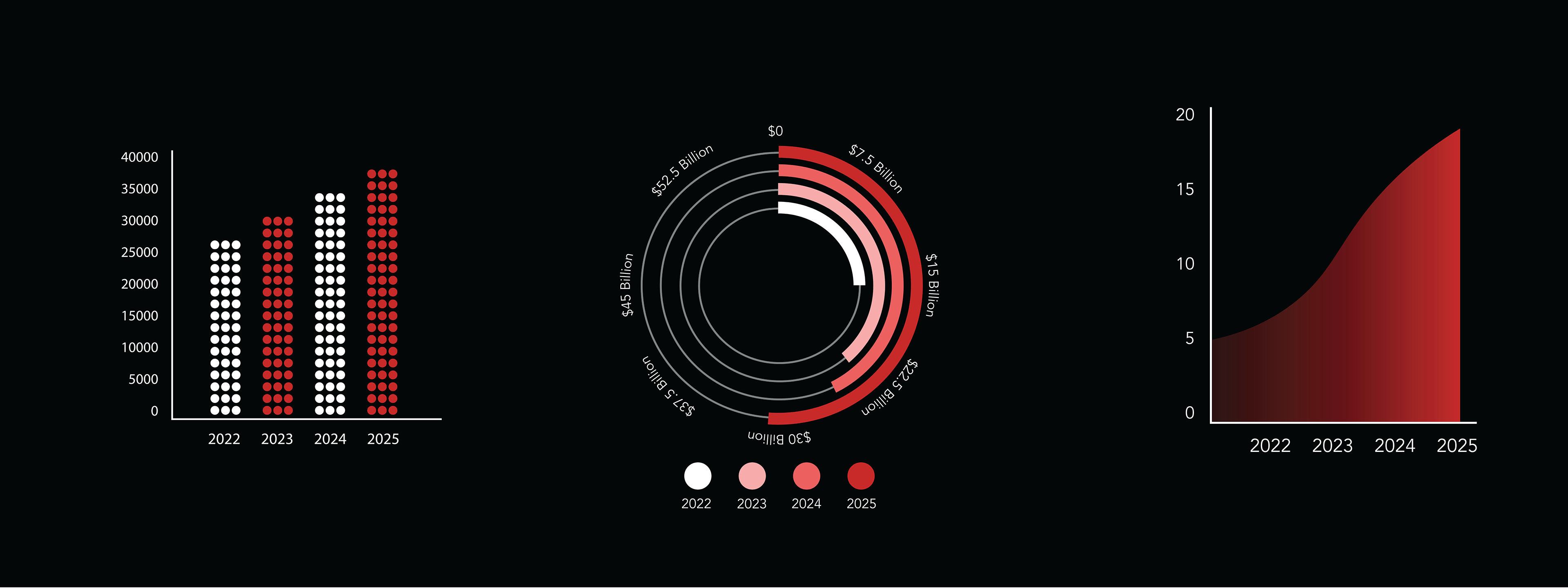
Graphs: 1. Employee Growth, 2. Net Revenue, 3. Carbon Emission Cuts