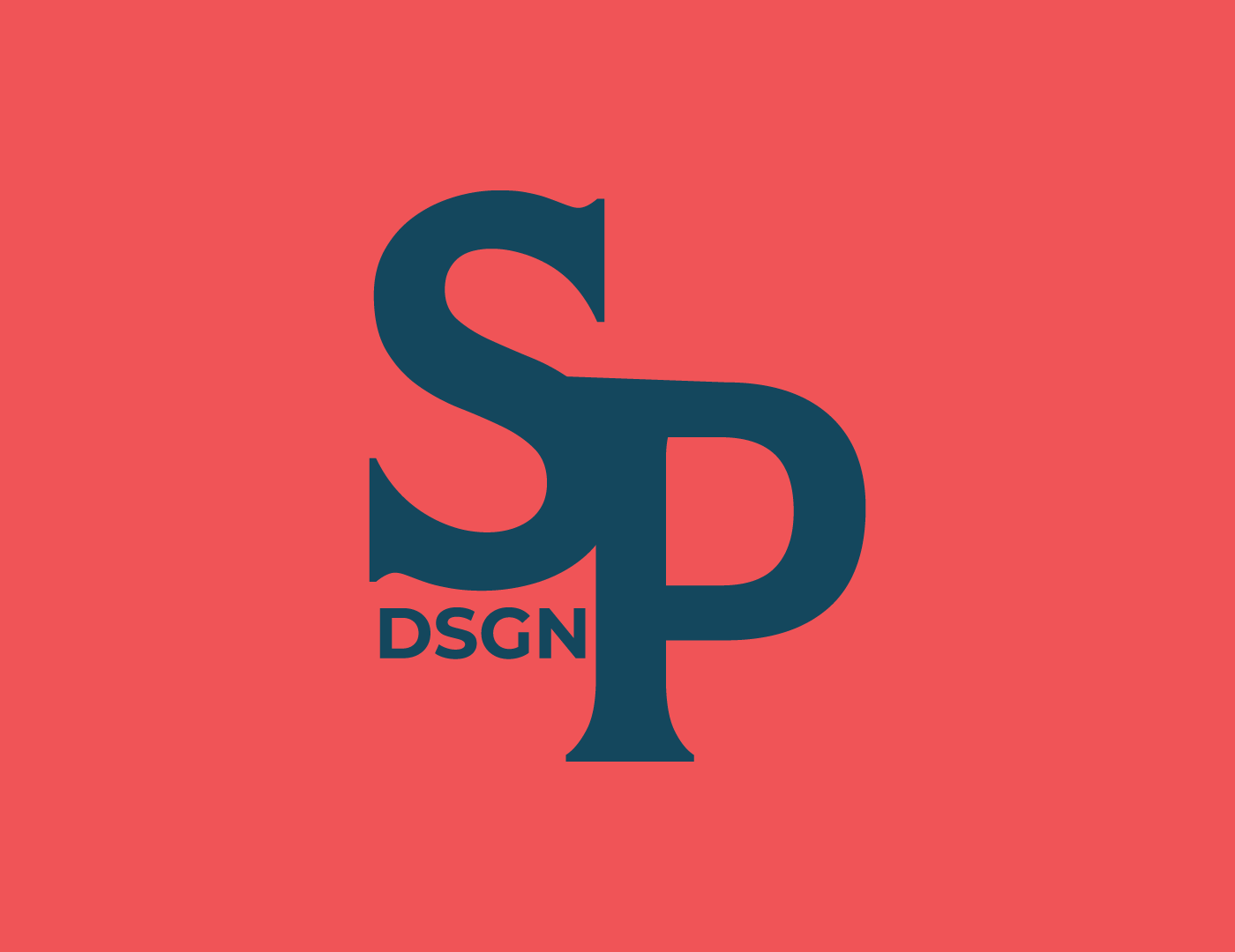
The logo behind my brand, Sean Pol Design, is an amalgamation of years of personal experiences. It calls back to my childhood while encapsulating who I am in the present day. The colors are inspired from the vibrant houses of Providence, RI, and how those houses complement the navy hue of the Atlantic Ocean. Throughout my life so far, Providence is one of the places I find myself going to the most. Only 25 minutes away from where I grew up, It is a place of many precious memories for me. The primary font, Romano, is an ode to my deep fascination with the city of Rome, both ancient and present, and the endless history of art and design related to that gorgeous city. The name, "Sean Pol Design." is a callback to my high school art account, "Sean Pol Art," where I shared my early artwork before I even considered becoming a designer.
Interestingly enough, creating a brand for myself was much more challenging than creating one for other people. Often times, it is easy to pick out observations and attributes when you're looking outside in, but transforming myself into a singular logo seemed nearly impossible, as I was unable to observe from an outsider's perspective.